Color Psychology in Interior Design: Choosing the Right Palette
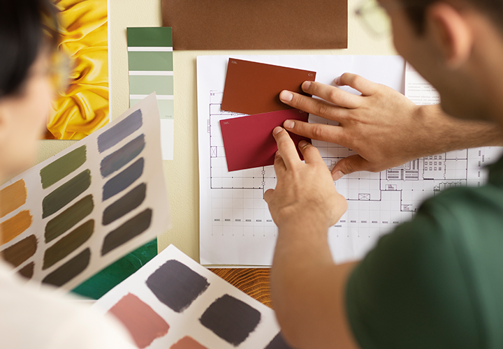
Colors influence our mood, productivity, and energy. By understanding color psychology, you can create spaces that evoke the desired emotions. Here’s a guide to selecting the perfect color palette for your home.
Calming Blues for Bedrooms
Blue is known for its calming properties, making it ideal for bedrooms and bathrooms. Light shades promote relaxation, while deeper blues add sophistication. Pair blue walls with white or soft grey accents for a tranquil retreat.
Energizing Reds for Dining Areas
Red is a bold color that stimulates appetite and conversation, perfect for dining rooms or kitchens. Use it as an accent—think red chairs or a backsplash—to avoid overwhelming the space.
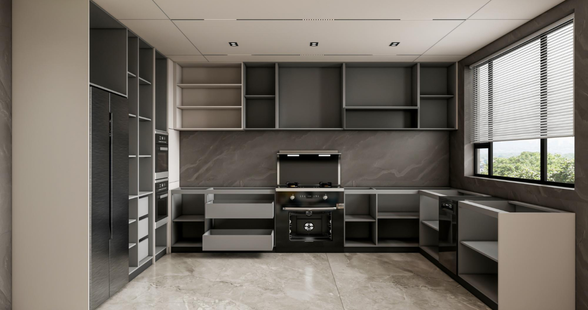
Cheerful Yellows for Kitchens
Yellow symbolizes happiness and energy. It’s an excellent choice for kitchens and breakfast nooks. Pair bright yellows with neutral tones for balance.
Grounding Greens for Living Spaces
Green, a color of nature, brings harmony and balance. It works well in living rooms, creating a calming yet refreshing environment. Combine green with earthy browns or whites for a cohesive look.
Serene Neutrals for Common Areas
Neutral tones like beige, taupe, and grey create a welcoming and versatile backdrop. They’re perfect for common areas like living rooms and hallways, allowing other design elements to stand out.
When choosing colors, consider the room’s purpose and natural light. A well-chosen palette can transform not just your home but also your day-to-day experiences.